Case Study - Flocus
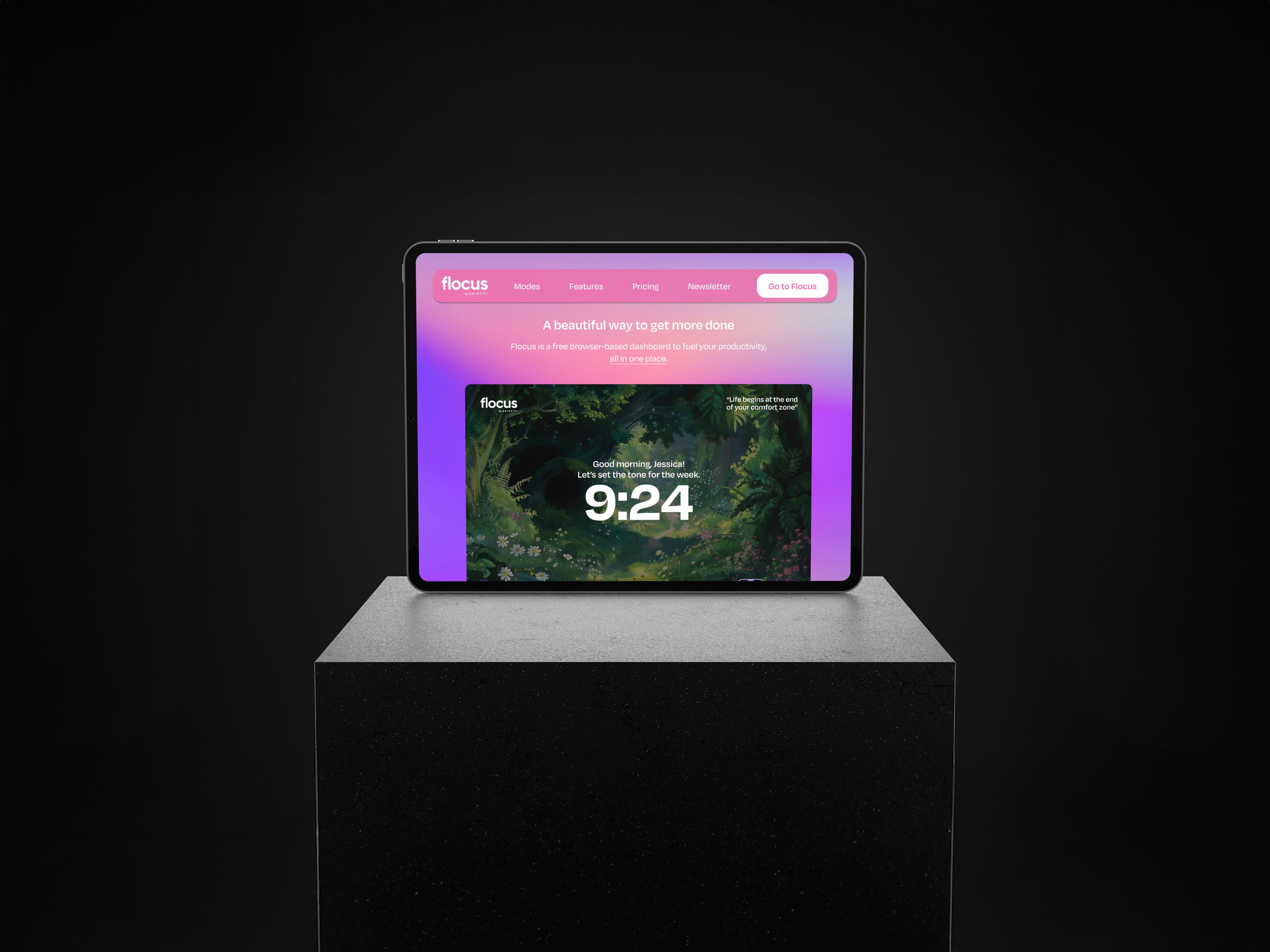
Website redesign aligning with the app’s UI and color palette, improving navigation and clarifying pricing.
Overview
Flocus is a productivity app designed to help users stay on track and build consistent work habits. I redesigned the existing website to make the product easier to navigate and keep the UI aligned with the app. My focus was on reducing visual clutter and making important information easier to find.
UX & Redesign
I started by reviewing the existing website and identifying areas that could be improved. The pricing section didn’t need a separate page and some of the key features were difficult to find.
I reorganized the content and navigation to create a clearer path through the website. I also simplified the pricing section so users could compare the available options more easily.
Website
The interface was redesigned to support smoother interactions and clearer navigation, with a cleaner and more structured layout. Improvements in typography, spacing, and visual consistency help guide users through the product and make interactions feel more predictable and easy to follow.
A key challenge was balancing multiple functionalities without adding complexity or disrupting the core focus experience. This was addressed by reorganizing the layout, refining interaction patterns, and prioritizing the most important actions on each screen.
